




How to Color Match in Photoshop: 3 Easy Techniques & Advanced Methods
Share:
Table of Contents
- 1. Why color matching is critical in real estate and architectural photography
- 2. Essential preparation for color matching in Photoshop: Setting up your digital workspace
- 3. Master guide: How to color match 2 images in Photoshop
- 4. How to match skin color in Photoshop for real estate lifestyle photography
- 5. Advanced variations and edge cases of color matching in architectural photography
- 6. Workflow optimization: How to maximize efficiency and consistency
- 7. Common color matching mistakes to avoid in Photoshop
- 8. When to DIY vs. when to outsource to professional editors
- 9. Conclusion
In commercial photography, consistency is the hallmark of professionalism. Imagine presenting a luxury listing where the living room appears warm and inviting, but the adjacent open-concept kitchen looks sterile, blue, and cold. Or consider a commercial shoot where an agent’s skin tone shifts drastically from one room to another. Varying light temperatures, camera sensors, exposures, and environmental reflections just make an editor’s day harder to achieve pleasant results. To address this specific problem, we will break down how to color match in Photoshop, explore precise techniques for color matching 2 images in Photoshop, delve into how to match skin color in Photoshop for lifestyle real estate shots, and highlight common pitfalls to avoid.
1. Why color matching is critical in real estate and architectural photography
Architectural photography is fundamentally about spatial narrative and spatial continuity. When a client or prospective homebuyer scrolls through an online gallery or flips through a printed brochure, their brain builds a 3D cognitive map of the property.
1.1. Spatial continuity and visual flow
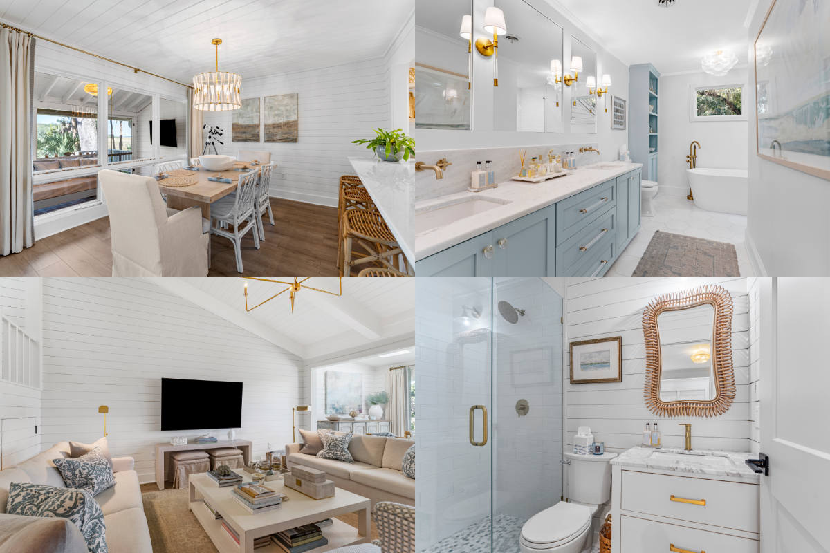
If the hardwood floor in the hallway displays a rich mahogany tone, but looks like pale oak in the bedroom photo because of window daylight spill, the viewer experiences cognitive dissonance. Seamless color matching in Photoshop maintains spatial integrity, ensuring that materials, paint finishes, and structural elements remain true to life across the entire set.
1.2. Managing mixed lighting environments
Real estate interiors are notorious for mixed lighting scenarios. You are frequently balancing:
- Ambient daylight (approx. 5500K–6500K) coming through windows.
- Interior LED or tungsten fixtures (approx. 2700K–3000K).
- Green color casts bounced off lush outdoor lawns through glass doors.
Learning how to color match in Photoshop allows you to harmonize these disparate light sources, blending flash exposures with ambient frames effortlessly.
1.3. Brand consistency for real estate agents and developers
High-profile real estate firms, interior designers, and architects build their reputations on brand aesthetics. A cohesive portfolio translates directly to higher property valuations and client trust.
2. Essential preparation for color matching in Photoshop: Setting up your digital workspace
Before learning how to color match in Photoshop, you must ensure your environment and files are properly calibrated. Color matching without proper setup is like painting in the dark.
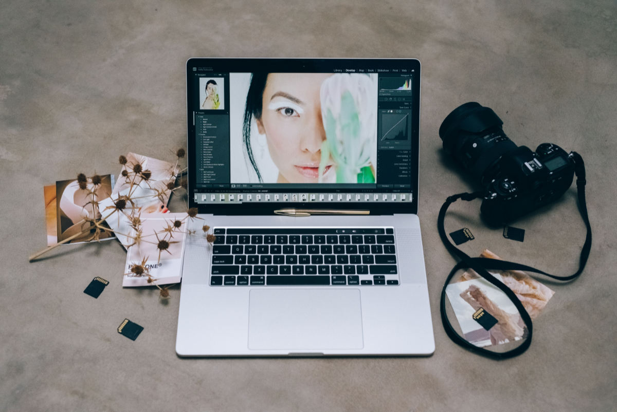
- Monitor calibration: You cannot match colors accurately on an uncalibrated display. Use a hardware colorimeter (such as a Calibrite ColorChecker or Datacolor Spyder) to calibrate your monitor to a standard brightness (typically 80–120 cd/m²) and a D65 white point (6500K).
- Color space standardization: Work in a wide color space during editing, such as Adobe RGB (1998) or ProPhoto RGB, to preserve maximum tonal data. When outputting for real estate platforms or the web, always convert the final images to sRGB.
- Choosing your anchor (reference) image: Select one master image from the shoot that best represents the true colors, correct white balance, and ideal contrast of the space. Every other image in the series will be matched to this anchor.
3. Master guide: How to color match 2 images in Photoshop
There are multiple ways to execute color matching in Photoshop, ranging from automated tools to advanced manual controls. Let’s examine the three most effective methods used by professional photo editors.
|
COLOR MATCHING WORKFLOW IN PHOTOSHOP |
|
1. Select Reference Image (Master Anchor) |
|
2. Import target image as a layer |
|
3. Apply matching method: |
|
4. Refine with layer masks & opacity |
3.1. Method 1: The Match Color tool (Quick & effective)
The built-in Match Color feature is the fastest way to understand how to color match 2 images in Photoshop, particularly for architectural frames shot under similar lighting conditions.
1. Open both the target image (the one that needs correction) and the source/reference image in Photoshop.
2. Select the target image window. Go to Image > Adjustments > Match Color...
3. In the dialog box, set the Source dropdown to your reference image file.
4. Set the Layer dropdown to the specific layer of the reference image you want to pull color data from.
5. Fine-tune the results using the sliders:
- Luminance: Adjusts the overall brightness.
- Color Intensity: Controls saturation levels.
- Fade: Blends the matched color back toward the original state.
6. Click OK.
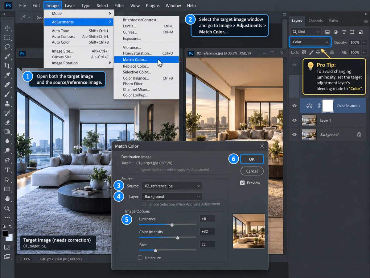
Pro Tip: To avoid changing the luminosity of your target image, set the target adjustment layer’s blending mode to Color.
3.2. Method 2: Curves adjustment & sample points (The professional precision method)
For commercial architecture and luxury real estate, automated tools often fall short. Manual matching using sample points and Curves offers ultimate mathematical precision.
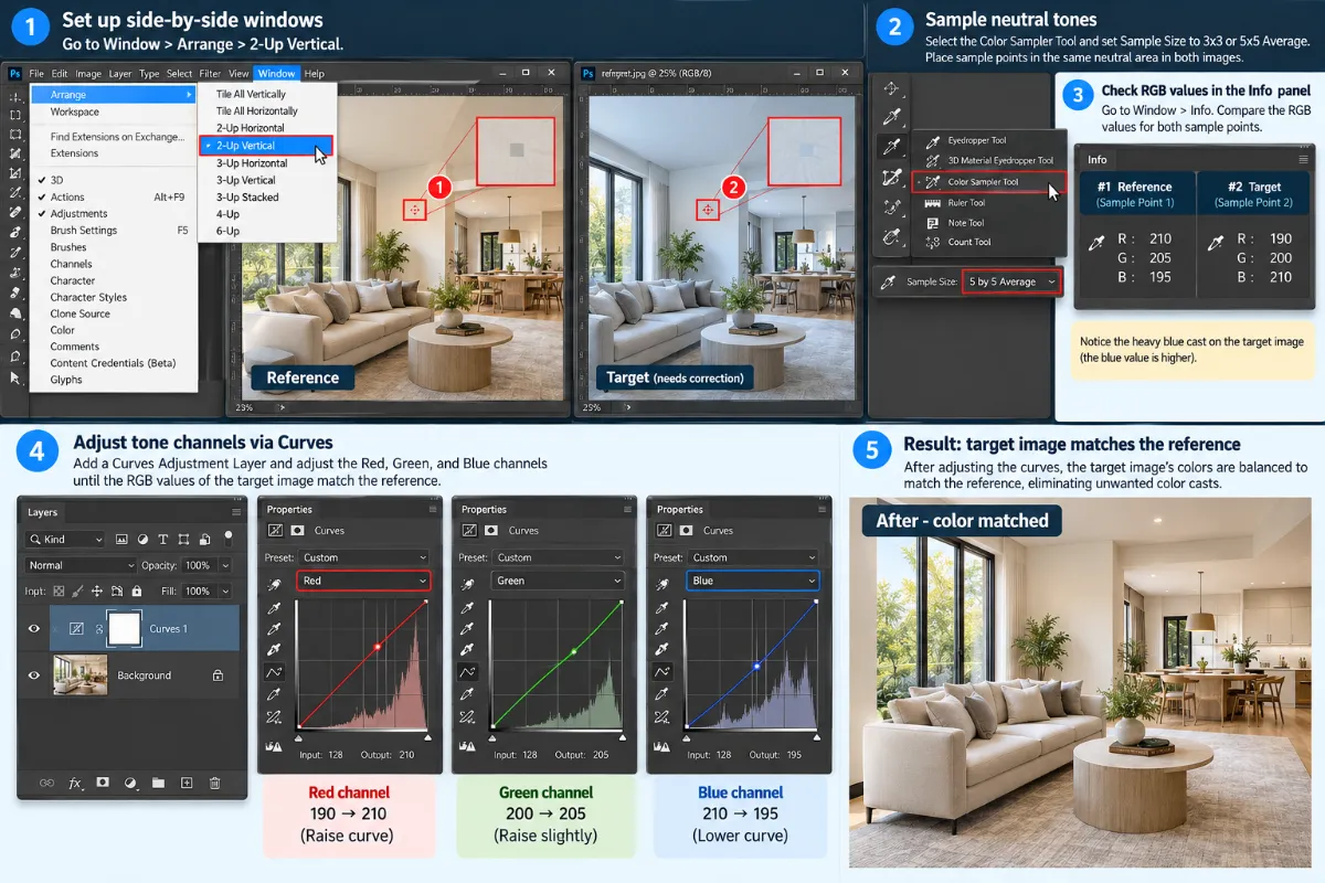
Step 1: Set up side-by-side windows
Go to Window > Arrange > 2-Up Vertical. Put your reference image on one side and your target image on the other.
Step 2: Sample neutral tones
1. Select the Color Sampler Tool (hidden under the Eyedropper menu).
2. Set the Sample Size in the top options bar to 3x3 or 5x5 Average (never use Point Sample, as it picks up noise).
3. Find a neutral area present in both images (e.g., a white wall, a gray countertop, or a concrete floor).
4. Place Sample Point 1 on the reference image and Sample Point 2 on the target image in equivalent areas.
Step 3: Open the Info Panel
Go to Window > Info. Observe the RGB values for both sample points.
- Example Reference: R: 210, G: 205, B: 195
- Example Target: R: 190, G: 200, B: 210 (Notice the heavy blue cast on the target)
Step 4: Adjust tone channels via Curves
1. Add a Curves Adjustment Layer above your target image.
2. In the Curves Properties panel, switch from the RGB channel to the individual Red, Green, and Blue channels.
3. Adjust the midpoints or end-nodes of each channel until the RGB output values of Sample Point 2 match those of Sample Point 1.
Channel Adjustments Example:
- Target Red: 190 -> Raise curve to reach 210
- Target Green: 200 -> Raise curve slightly to reach 205
- Target Blue: 210 -> Lower curve to drop to 195.
By manually balancing the RGB curves, you eliminate unwanted color casts while maintaining full non-destructive control.
3.3. Method 3: Gradient maps & blending modes (Matching atmospheric tone)
When matching exterior real estate photography, such as matching a garden image shot under overcast skies to a hero exterior shot during golden hour, Gradient Maps work wonders.
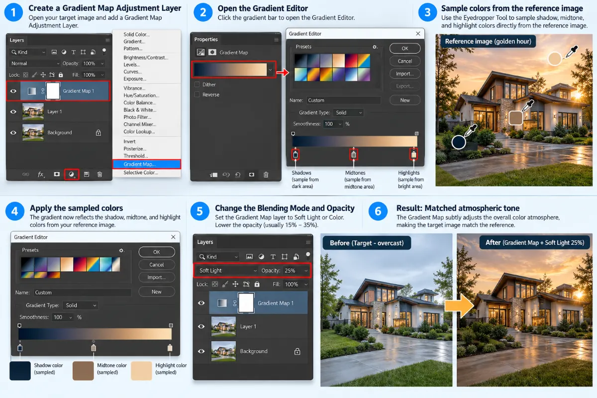
1. Create a Gradient Map Adjustment Layer over the target image.
2. Click the gradient bar to open the Gradient Editor.
3. Sample colors directly from your reference image:
- Set the left stop (shadows) by clicking the color picker and sampling a dark shadow area from the reference image.
- Set a middle stop (midtones) by sampling a midtone brick, wall, or sky tone from the reference.
- Set the right stop (highlights) by sampling the brightest neutral highlight from the reference.
4. Click OK.
5. Change the Blending Mode of the Gradient Map layer to Soft Light or Color.
6. Lower the layer Opacity (usually between 15% and 35%) to blend the atmospheric tones seamlessly.
4. How to match skin color in Photoshop for real estate lifestyle photography
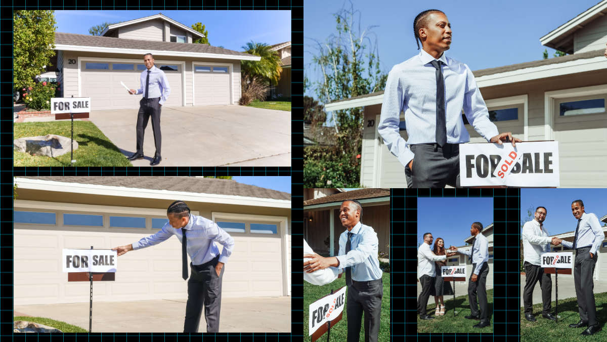
Modern real estate marketing frequently incorporates lifestyle elements: real estate agents greeting clients, families relaxing in living rooms, or chefs preparing food in staged kitchens.
However, interior lighting can distort human skin tones horribly, turning skin orange under tungsten bulbs or sickly green under tinted windows. Learning how to color match in Photoshop is vital for high-end editorial property shoots.
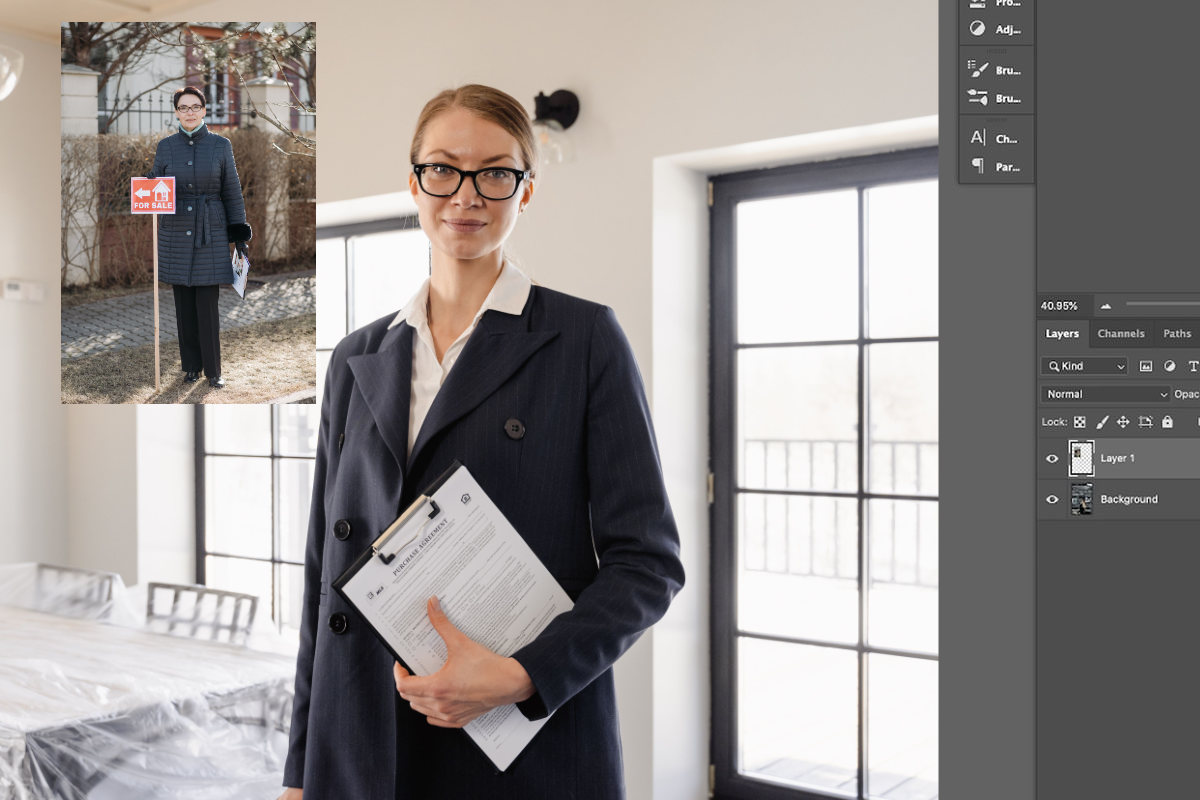 Editors should also know how to match skin color in Photoshop.
|
SKIN TONE MATCHING TARGET GUIDELINES | |
|
Metric |
Target balance ratio |
|
Cyan |
Approx. 1/3 to 1/5 of the Magenta value |
|
Yellow |
Typically equal to or slightly higher than Magenta |
|
RGB Check |
Red should always be the dominant channel |
Step 1: Establish your reference skin tone
Open a reference image containing a healthy, perfectly balanced skin tone under neutral lighting.
Step 2: Use CMYK values for skin analysis
Even if your image is in RGB mode, the Info Panel set to CMYK gives the most reliable readouts for natural skin tones.
1. Select the Color Sampler Tool (5x5 Average).
2. Click on a midtone area of skin on the reference subject (forehead or cheek, avoiding extreme highlights or heavy blushes).
3. Open the Info Panel and set the sample readout to CMYK.
Universal Skin Tone Rule: Regardless of ethnicity, naturally exposed human skin generally follows a consistent mathematical ratio in CMYK:
- Cyan should be roughly 1/3 to 1/5 of the Magenta value.
- Yellow is almost always equal to or slightly higher than Magenta.
- Black (K) should be close to 0%.
Step 3: Match the target skin tone
1. Place a second sample point on the cheek/forehead of your target subject.
2. Add a Curves or Selective Color Adjustment Layer above the target layer.
3. If using Selective Color, select the Reds and Yellows from the dropdown menu.
4. Adjust the Cyan, Magenta, and Yellow sliders until the CMYK values at Target Sample Point 2 match the mathematical ratio established by Reference Sample Point 1.
Step 4: Mask the Adjustment Layer
Skin color matching adjustments should rarely apply to the entire image.
1. Invert the layer mask on your adjustment layer by pressing Ctrl+I (Windows) or Cmd+I (Mac) to hide the effect.
2. Select a soft Brush Tool (B) with white foreground color.
3. Paint precisely over the subject’s exposed skin areas, keeping the surrounding architectural elements untouched.
5. Advanced variations and edge cases of color matching in architectural photography
Real estate and architectural editing present unique scenarios where standard color matching needs custom tweaks.
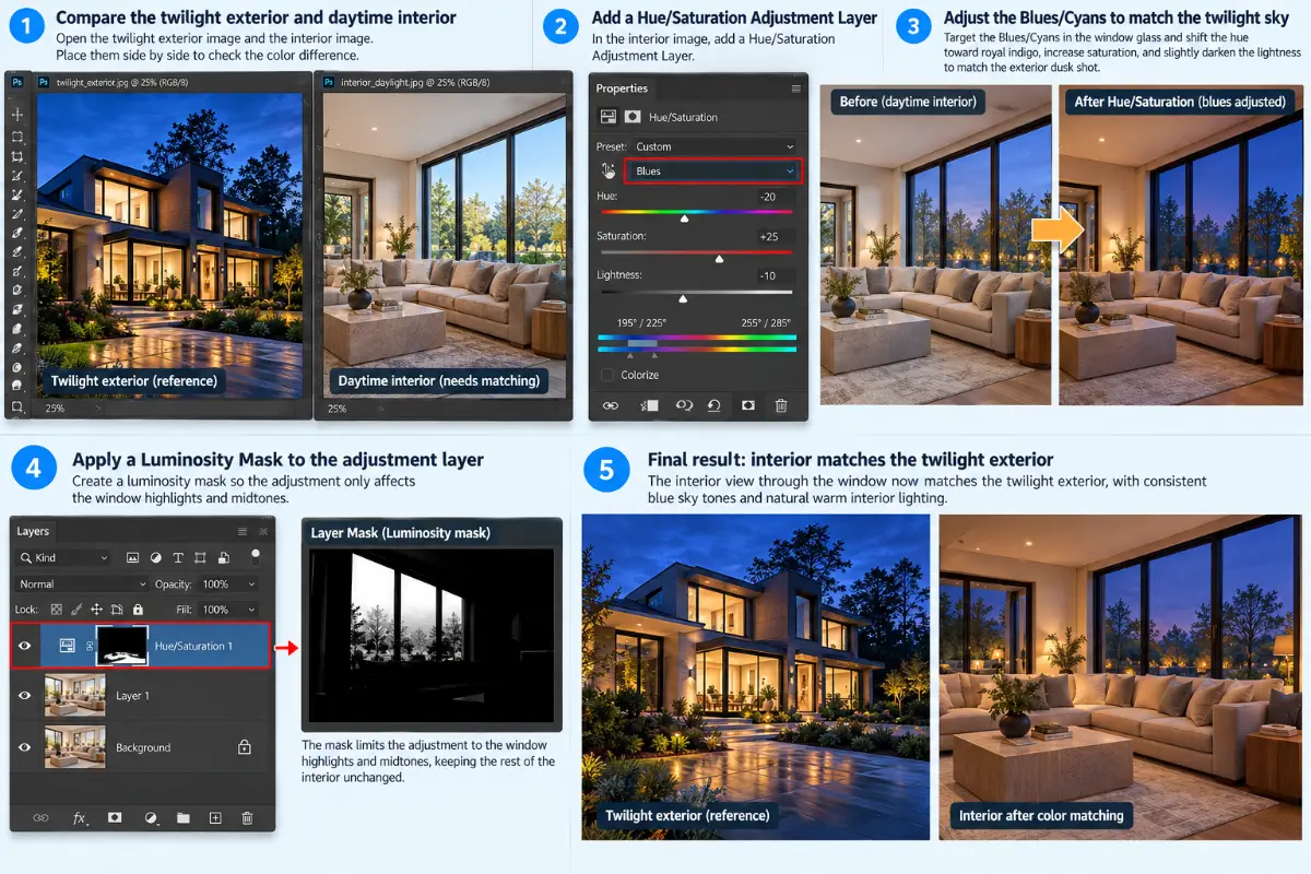
5.1. Matching twilight (Day-to-Dusk) images to daytime interiors
Twilight images feature deep blue sky tones (approx. 8000K–10000K) paired with warm interior ambient lighting. When color matching an interior shot viewed through a window in a twilight frame:
- Use a Hue/Saturation Adjustment Layer.
- Target the Blues/Cyans in the window glass and shift the hue toward royal indigo to match the exterior dusk shot.
- Apply a Luminosity Mask so the adjustment affects only the window highlights and midtones.
There’s much more to this kind of edit if you want to venture into it.
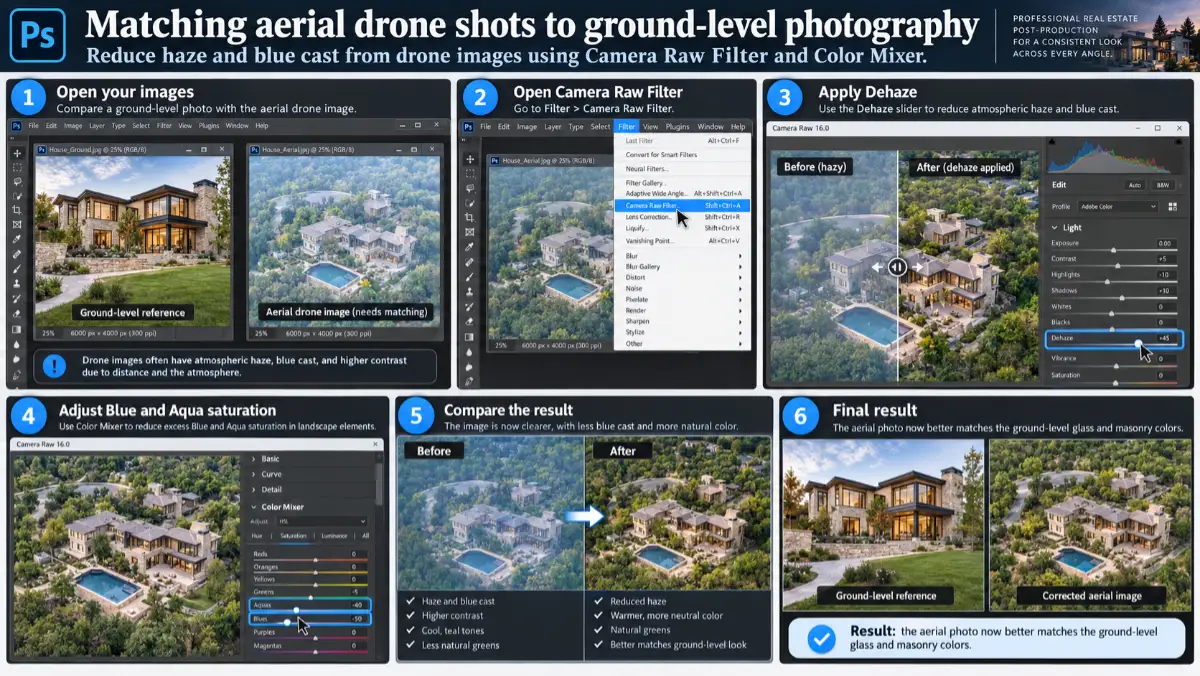
5.2. Matching aerial drone shots to ground-level photography
Drone cameras feature smaller sensors and built-in lens profiles that differ significantly from full-frame DSLR/mirrorless cameras. Aerial photos often suffer from atmospheric haze (blue color cast) and elevated contrast.
- Apply a Dehaze adjustment in the Camera Raw filter (Filter > Camera Raw Filter).
- Use the Color Mixer in Camera Raw to pull down excess Blue and Aqua saturation in the landscape elements to match the ground-level glass and masonry colors.
|
AERIAL VS. GROUND-LEVEL MATCHING CHECKLIST | |
|
Issue |
Solution |
|
Atmospheric blue haze |
Camera Raw > Dehaze + Red. Cyan |
|
Over-saturated foliage |
Color Mixer > Target Green/Yellow |
|
Contrast discrepancy |
Match curve midtone slopes |
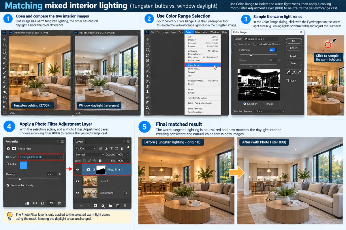
5.3. Mixed interior lighting (Tungsten bulbs vs. window daylight)
A common scenario when you are learning how to color match in Photoshop with real estate images. When matching two rooms where one relies entirely on 2700K recessed lighting and the other on window light:
- Isolate the warm light zones using Color Range Selection (Select > Color Range).
- Sample the yellow/orange light cast.
- Apply a Photo Filter Adjustment Layer set to a Cooling Filter (80B) restricted to that selection mask.
6. Workflow optimization: How to maximize efficiency and consistency
For busy commercial photographers processing hundreds of frames per shoot, color matching manually frame-by-frame can consume hours. Here is how to speed up the process:
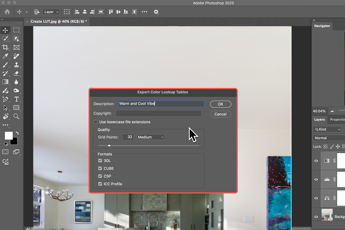
6.1. Create custom 3D LUTs (Look-up tables)
Once you successfully grasp how to color match in Photoshop between a challenging reference frame and a target frame:
1. Go to File > Export > Color Lookup Tables...
2. Save the transformation as a 3D LUT (.CUBE file).
3. Import this LUT into Adobe Lightroom or Photoshop or other photo editing apps to apply identical color mapping across an entire batch of images in one click.
6.2. Leverage Smart Objects
Always convert your image layers into Smart Objects before applying Camera Raw Filters or Match Color adjustments. This preserves your original data and allows you to adjust parameters at any stage without starting over.
6.3. Use Reference View in Camera Raw / Lightroom
Before even bringing files into Photoshop, open your set in Adobe Camera Raw. Enable Reference View (Shift + R) to compare your active frame side-by-side with your reference frame while tweaking white balance and color mix sliders globally.
7. Common color matching mistakes to avoid in Photoshop
Even seasoned photographers knowing how to color match in Photoshop fall into traps when executing the technique. Watch out for these crucial errors:
|
COMMON COLOR MATCHING MISTAKES |
|
[!] Ignoring Luminance while adjusting Color (creates muddier looks) |
Ignoring luminance and contrast: Color perception is heavily influenced by brightness. If Image A is exposed at 0 EV and Image B is exposed at -1 EV, their colors will never appear matched, even if the RGB values line up in theory. Always match exposure and contrast levels before matching hue and saturation.
Pushing colors beyond the gamut: Drastically shifting colors in 8-bit JPEG files leads to severe posterization (color banding). Always work with 16-bit RAW files when doing complex color matching to avoid breaking the image data.
Forgetting secondary bounces: When changing the color of a room wall to match another frame, remember that light bounces. If a wall was originally yellow, it casts yellow light onto adjacent white ceilings and timber floors. You must mask and correct those secondary light bounce areas as well.
Over-saturating to force alignment: When struggling to match two colors, a common mistake is boosting saturation. This results in unnatural, harsh tones that look fake to potential home buyers. Instead, focus on Hue adjustments first, then fine-tune Saturation.
Over-editing natural variations: Remember that light naturally behaves differently across different architectural angles. A shadowed alcove should be slightly darker and cooler than a sunlit window seat. Forcing every corner of a property to have identical color values strips away depth and realism.
8. When to DIY vs. when to outsource to professional editors
Understanding how to color match in Photoshop is vital for any professional image-maker. However, running a commercial photography or architectural business requires balancing high creative standards with business scalability.
8.1. The math of high-volume production
A standard residential real estate shoot yields 25–50 final images. A commercial architectural project or hotel resort shoot may require 100+ meticulously matched hero shots.
- Manual color matching, window pulling, HDR blending, and skin matching can take anywhere from 10 to 20 minutes per image.
- Processing a single property listing can easily consume 6 to 10 hours of manual editing time, even if you have mastered how to edit real estate photos.
8.2. Why professional editing services make sense
This is where specialized real estate photo editing partners like Fotober become invaluable assets to your business workflow.
|
IN-HOUSE EDITING VS. OUTSOURCING (FOTOBER) | ||
|
Factor |
DIY editing |
Fotober outsourcing |
|
Time cost per shoot |
5 - 8 hours |
15 minutes (Review) |
|
Turnaround time |
24 - 48 hours |
12 - 24 hours |
|
Scalability |
Limited by hours |
Unlimited volume |
|
Consistency |
Varies with fatigue |
Dedicated QA team |
Scalability without sacrificing quality: Outsourcing technical color matching, HDR blending, day-to-dusk conversions, and lawn/sky enhancements allows photographers to focus on shooting, winning higher-value clients, and growing their business.
Dedicated color consistency: Professional real estate editing teams at Fotober utilize standardized hardware setups, expert Photoshop workflows, and strict Quality Assurance (QA) checks. They ensure that every image across an entire property portfolio matches perfectly in tone, white balance, and contrast.
Complex retouching made effortless: Whether it's removing complex mixed color casts from low-CRI LED lights, matching agent skin tones in multi-exposure lifestyle compositions, or matching drone aerials to twilight grounds, professional editors handle complex edge cases effortlessly.
9. Conclusion
Mastering how to color match in Photoshop elevates your work from basic real estate snapshots to high-end architectural imagery. By using accurate calibration, utilizing Curves with explicit RGB sample points, mastering the math behind skin tone ratios, and leveraging layer masks, you can solve even the most complex color discrepancies.
Apply these steps to your next project to maintain visual continuity across your portfolio. And when client volume grows and time becomes your most precious asset, lean on professional post-production partners like Fotober to deliver high-quality, perfectly color-matched image sets straight to your inbox.
Ready to streamline your real estate editing workflow? Discover how Fotober can elevate your property listings with expert color matching, seamless HDR blending, and lightning-fast turnarounds. Contact our team today for a free trial edit!
What is your go-to technique to color match? Let us know on our social media, and follow us today for more expert real estate marketing strategies and the latest editing techniques for making every home listing shine.
- Facebook: fotobermedia.co
- YouTube: Fotober
- TikTok: @fotober
- Instagram: fotober_media.
Related posts

San Antonio Housing Market Forecast 2026: Prices & Trends
October 30, 2026

What Drives Mortgage Rates? Explain The Forces Behind 2026's Numbers
October 29, 2026

Dallas vs. Los Angeles Housing Market: Comparing Prices & Supply
October 29, 2026

Orlando Population Growth in 2026: Trends & Housing Demand
October 26, 2026
